Choosing the best font for a website involves a thoughtful process that balances aesthetics, readability, and brand identity. Firstly, it’s crucial to understand your audience demographics and preferences, as different groups may respond better to specific font styles. Secondly, consider your brand’s personality and values, ensuring that the chosen font reflects and enhances your brand identity. Prioritize readability by opting for fonts that are clear and legible across various devices and screen sizes. When using multiple fonts, pair them thoughtfully to create visual harmony and contrast. Test your font choices on different devices and browsers to ensure consistent rendering. Additionally, prioritize accessibility by selecting fonts that meet accessibility standards. Choose from web-safe fonts or web fonts to ensure compatibility and consistency. While creativity is essential, functionality should not be compromised, so strike a balance between the two. Reviewing competitors and industry standards can provide valuable insights into effective font choices within your niche. Finally, gather feedback from stakeholders or target audience members to validate your font selection. Ultimately, the chosen font should resonate with your audience, reinforce your brand identity, and enhance the overall user experience of your website.
FONT FORMATS
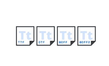
TrueType (TTF): TrueType fonts were developed by Apple and Microsoft in the late 1980s. They are widely used and supported across different operating systems and platforms. TrueType fonts contain both font data and instructions for rendering the typeface accurately on screen and in print
Open Type (OTF): Open Type is a format developed by Adobe and Microsoft in the late 1990s. It is an extension of TrueType and Post Script font formats, offering additional features such as support for more characters, advanced typographic capabilities ligatures, alternate characters, etc., and cross-platform compatibility.
Web Open Font Format (woff/woff2): WOFF and WOFF2 are font formats specifically optimized for web use. They are compressed versions of TrueType and Open Type fonts, respectively, designed to improve web page loading times and performance. WOFF and WOFF2 fonts are widely supported by modern web browsers.
Choosing the Right Typeface :
Choosing the right typeface is a critical decision in any design project, as it significantly influences the overall look and feel of the final product. When selecting a typeface, several key factors should be considered to ensure its suitability and effectiveness. Firstly, it’s essential to understand the project’s context and purpose. Whether it’s a website, a logo, or a printed publication, the typeface should align with the intended message and audience. For example, a formal document might require a classic serif typeface to convey professionalism and authority, while a contemporary brand might opt for a clean and minimalist sans-serif typeface to reflect modernity and simplicity. Additionally, consider the readability of the typeface, particularly for longer passages of text. Ensure that the chosen typeface is legible at various sizes and weights and that it maintains clarity across different mediums and devices. Pay attention to typographic details such as letter spacing, line height, and font weight to optimize readability and visual appeal. Furthermore, explore different typeface pairings and combinations to create contrast and hierarchy within your design. By carefully considering these factors and experimenting with various options, you can select a typeface that not only enhances your project’s aesthetic appeal but also effectively communicates your message to your audience.
Selecting a font delivery method
- Self-hosting
- Web Font Services
- System Fonts
Self-hosting : Self-hosting, you host the font files on your own server and reference them directly in your website’s CSS. This method provides maximum control over font rendering and performance but requires you to manage font files and server configuration. Use web font formats like WOFF or WOFF2 for compatibility across different browsers.
Web Font Services : Web font services like Google Fonts, Adobe Fonts (formerly Type kit), and Fonts.com offer vast libraries of fonts that you can easily integrate into your website via JavaScript or CSS. These services handle font hosting, delivery, and compatibility across various devices and browsers, simplifying font management and ensuring optimal performance.
System Fonts : Utilizing system fonts, such as those included with operating systems (e.g., Arial, Times New Roman), can improve performance by leveraging locally installed fonts on users’ devices. However, this method limits font selection and may not provide consistent typography across different platforms.
Font color contrast and readability :
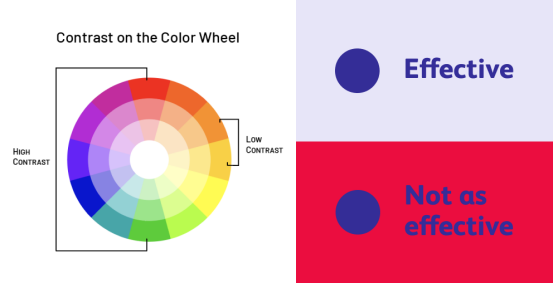
Font color plays a crucial role in readability, especially in digital content where contrast can significantly impact legibility. When choosing font colors, it’s essential to ensure sufficient contrast between the text and its background to make the content easily readable for all users, including those with visual impairments. High-contrast combinations, such as dark text on a light background or vice versa, generally offer better readability. Additionally, consider the context of your content and the preferences of your audience when selecting font colors to ensure accessibility and user engagement. By prioritizing color contrast and readability, you can enhance the effectiveness and accessibility of your content across various platforms and devices.
Standard font for using frequently and commonly used :
1. Helvetica
2. Futura
3. Garamond
4. Times New Roman
5. Arial
6. Verdana
7. Comic Sans
8. Trebuchet
9. Gill Sans
10. Georgia
Helvetica :
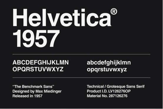
Helvetica is a widely used sans-serif typeface developed in 1957 by Swiss typeface designer Max Miedinger with input from Eduard Hoffmann. It is known for its clean, modern appearance and has become one of the most popular typefaces in the world. Helvetica is often chosen for its versatility and legibility, making it suitable for a wide range of applications, including signage, advertising, and digital media.
Futura:
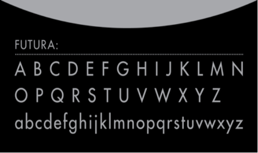
Futura is a geometric sans-serif typeface designed by Paul Renner in 1927. It embodies the essence of modernism with its clean lines and simple, geometric forms. Futura has been widely used in various design applications, from print to digital media, and is celebrated for its timeless elegance and legibility. Its distinctive characteristics, such as the circular shapes of the lowercase ‘a’ and ‘g’, contribute to its unique identity, making it a popular choice among designers seeking a sleek and contemporary aesthetic.
Garamond :
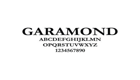
Garamond is a classic serif typeface that traces its roots back to the 16th century. It was originally designed by Claude Garamond, a French punch-cutter, and has since been refined by various typographers over the centuries. Garamond is characterized by its elegant proportions, delicate serifs, and high legibility, making it a popular choice for body text in printed materials such as books, magazines, and newspapers. Its timeless appeal and historical significance have cemented its status as one of the most enduring typefaces in the history of typography.
Times New Roman :
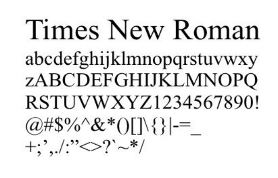
Times New Roman is a classic serif typeface designed by Stanley Morison and Victor Lardent in 1931. It was commissioned by the British newspaper, The Times, hence its name. Times New Roman is known for its traditional and authoritative appearance, making it a popular choice for academic papers, books, and formal documents. Its clear legibility, balanced proportions, and timeless design have made it a staple font in the publishing industry for decades, earning it a reputation as one of the most widely used typefaces in the world.
Arial :
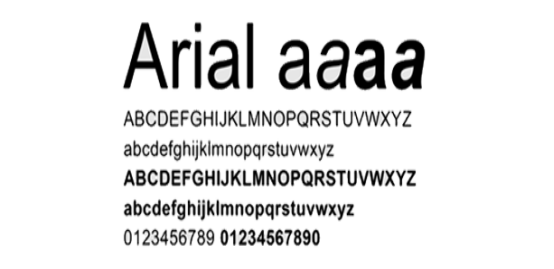
Arial is a widely used sans-serif typeface designed by Robin Nicholas and Patricia Saunders in 1982. It is known for its clean and modern appearance, with uniform stroke widths and simple letter forms. Arial is often chosen for its legibility and versatility, making it suitable for a wide range of applications, including print and digital media. Its popularity can be attributed to its widespread availability on most operating systems and its ability to maintain readability at various sizes. Arial has become one of the default fonts for many word processing and design software programs.
Verdana :
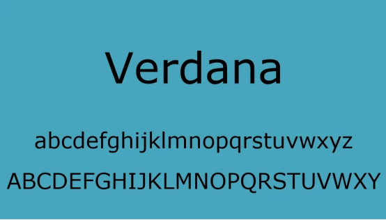
Verdana is a sans-serif typeface designed by Matthew Carter for Microsoft in 1996. It was specifically crafted for optimal legibility on computer screens, with generous spacing and large x-heights. Verdana’s clean and crisp appearance, along with its readability at small sizes, quickly made it a popular choice for web design and digital interfaces. Its rounded letter forms and ample spacing contribute to its friendly and approachable demeanor, making it suitable for a wide range of applications, from body text to headlines. Verdana remains a widely used font for both print and digital media due to its readability and versatility.
Comic Sans :
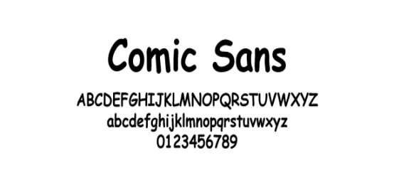
Comic Sans is a casual script typeface designed by Vincent Connare in 1994. It was originally created for use in Microsoft’s Bob program, aiming to mimic the style of comic book lettering. Despite its intended playful and informal nature, Comic Sans has garnered both praise and criticism over the years. While some appreciate its whimsical charm and accessibility, others criticize its overuse and lack of professionalism. Nonetheless, Comic Sans remains a popular choice for informal documents, children’s materials, and occasions where a lighthearted tone is desired.
Trebuchet :
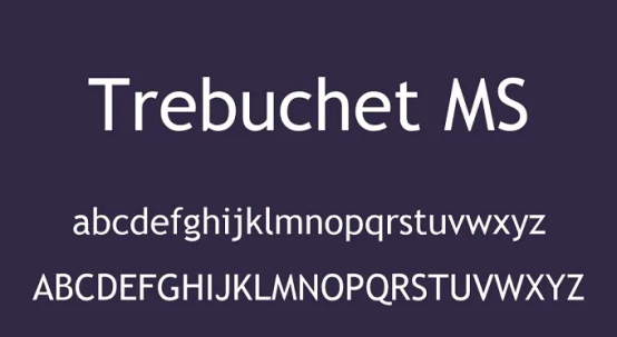
Trebuchet MS is a sans-serif typeface designed by Vincent Connare in 1996. Named after the medieval siege engine, Trebuchet MS embodies a sense of strength and stability with its bold letter forms and generous spacing. The font is known for its clean and modern appearance, making it suitable for a variety of design applications, including print and digital media. Trebuchet MS is often praised for its readability, even at smaller sizes, and its versatility makes it a popular choice for both body text and headlines in magazines, websites, and presentations.
Gill Sans :
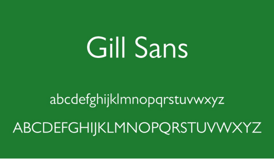
Gill Sans is a humanist sans-serif typeface designed by Eric Gill in the late 1920s. It is known for its clean lines, simple letter forms, and geometric proportions, which give it a timeless and versatile aesthetic. Gill Sans has been widely used in various design applications, including print, branding, signage, and digital media. Its legibility and distinctiveness make it a popular choice for body text and headlines alike. Gill Sans’s classic elegance and adaptability have cemented its status as one of the most enduring typefaces in the history of typography.
Georgia :
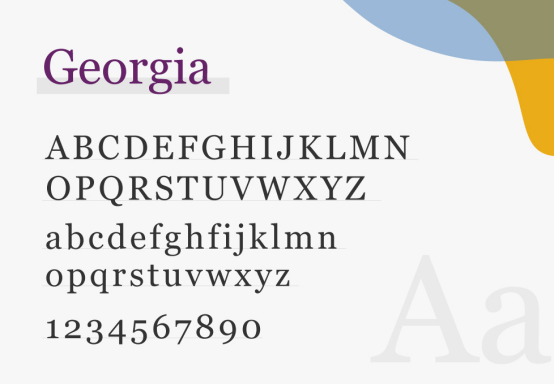
Georgia is a serif typeface designed by Matthew Carter and released by Microsoft in 1996. Inspired by the traditional letter forms of Renaissance-era typefaces, Georgia is known for its elegance and readability, particularly on screens. Its sturdy serifs and ample letter spacing contribute to its legibility, making it an excellent choice for body text in both print and digital media. Georgia’s classic yet contemporary appearance has made it a popular font for websites, e-books, and other online content, where clarity and readability are essential.